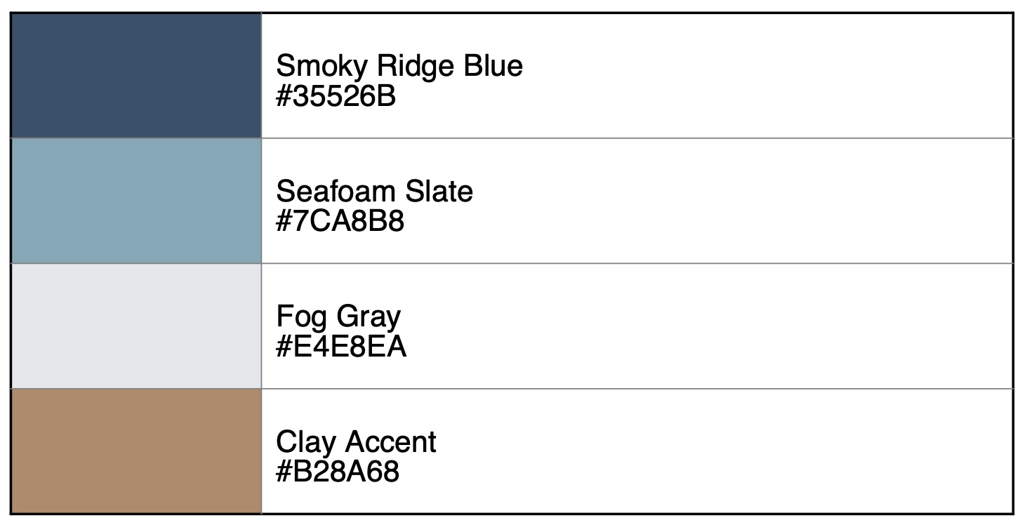
1. Brand Colors (Palette 4)
A soft, upscale, nature‑inspired palette.
- Smoky Ridge Blue –
#35526B - Seafoam Slate –
#7CA8B8 - Fog Gray –
#E4E8EA - Clay Accent –
#B28A68

2. Typography
Primary Font – Headings
Montserrat Bold
- Strong, modern, geometric sans-serif
- Used for: logos, headers, section titles
- Recommended Sizes: 28–72 pt depending on layout
Secondary Font – Subheadings & Highlights
Montserrat Medium / Semibold
- Clean accent to the primary
- Used for: subheadings, navigational text, callouts
Body Font
Lora Regular
- Elegant serif for a refined, coastal-nature feel
- Used for: paragraphs, descriptions, long-form content
- Recommended Sizes: 12–16 pt
3. Logo Usage Rules
Clear Space
Maintain at least 1× the height of the “B” in “Blue Ridge” on all sides.
Minimum Size
- Print: 1.25 inches wide
- Digital: 150 px wide
Approved Color Variations
- Full-Color Version: Smoky Ridge Blue + Seafoam Slate accents
- One-Color Dark: Smoky Ridge Blue
- One-Color Light: Fog Gray (on dark backgrounds)
Incorrect Usage
- Do not stretch or distort
- Do not alter colors outside palette
- Do not place over busy or low-contrast backgrounds
- Do not add drop shadows or glows
4. Color Usage Guidelines
Primary Color (Smoky Ridge Blue – #35526B)
- Use for headers, key shapes, brand accents, and main identity elements.
Secondary Color (Seafoam Slate – #7CA8B8)
- Use for supporting UI elements, backgrounds, and large areas of color.
Neutral (Fog Gray – #E4E8EA)
- Use for whitespace, page backgrounds, clean minimal layouts.
Accent (Clay Accent – #B28A68)
- Use sparingly for call-to-actions, highlights, or detail lines.
5. Photography & Style
- Mood: calm, coastal, misty, natural ridge landscapes
- Tones: desaturated, soft blues + warm natural earth tones
- Avoid: overly vibrant or high-contrast images
6. Example Use Cases
- Website headers with Smoky Ridge Blue overlays
- Business cards with Fog Gray background + Clay Accent details
- Apparel and merchandise in muted tones for premium feel
